Recreating NASA's Apollo project slip-chart (in Python)
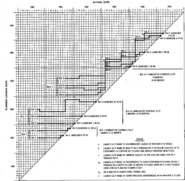
I first saw this kind of chart in a nice www.edwardtufte.com forum thread about project management charts. Specifically, the NASA Launch schedule slip chart caught my eye.
It shows how, and with annotations why, project milestones and deadlines moved. It is cleanly focused on milestones and, in my mind, provides a version history but for milestones. This is a nice complement to something like a Gantt chart which is more focused on the current version of a schedule.
In the chart, both axes are time, with the Y-axis being the projected end date. If a project has no hiccups or changes, then it forms a horizontal line starting from its inception date and ending on the diagonal at its completion date. If something changes, then the line moves up, for a delay, or down, if it is brought forward, with an annotation explaining why.
I really liked this idea and thought that it might be useful, or at least fun, for my own projects.
First, I wanted to recreate the original figure. The PDF versions in the repository come out a little better than the SVGs (shown here), which have some indentation and alignment issues in the notes. Also, some of the annotations are missing as they are more for presentation, and there was no simple way to automate them. Nonetheless, I still think it looks pretty good!
The diagonal nature of the plot is somewhat limiting, so here's the same data just rotated 45 degrees so that the completion line runs vertically up the center of the diagram. It has the downside that the nothing-wrong line is now a 45-degree bottom-left to top-right line, while slips are on the opposite bottom-right to top-left diagonal, making it somewhat harder to read at a glance.
In the end, I've not found much use for the plots as a project management tool, I think because it is only useful when there are sufficient real milestones in the project.
For other uses: I wondered about applying the plot to displaying downloading progress with something like multiple torrents or software updates; it might be useful for supply chain monitoring or journey arrival and departure scheduling to spot things like problematic connections or when resources will end up in the wrong place.
The plotting code can be found on GitHub and is simple to run. All the complexity is pushed into the tabular data file format used to store all the necessary information for the plot. This was done mostly for convenience, but also it ensured that there is a nice interface boundary where another parser or data source could be plugged in. Overall, the code was meant to demonstrate the type of diagram and not a pluggin or library, though it wouldn't take too much to convert it.
I've rarely seen this kind of chart. So, if you know of any examples of its use or have any other feedback, let me know.